
Wood-Look Tile: Warmth, Grain and Modern Layouts
October 19, 2026
Discover how grain direction, color variation and installation layout influence the character of wood-look tile.
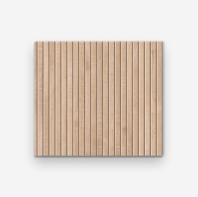
Wood-look tile offers a way to bring the visual character of timber into a tile palette. From pale maple-inspired tones to deep brown grain, the range can feel light, traditional or architectural. Choosing a look is only the beginning: the format and arrangement also shape the finished room.
Read the grain alongside your furniture
Compare the tile with the real timber in the space, including cabinets, doors and furniture. The finishes do not need to match exactly, but their undertones should feel considered together. A quieter grain can complement detailed cabinetry, while a more pronounced pattern may work well with simple furnishings.
Review more than one piece
Wood-inspired designs often include variation between faces. Look at several pieces or the available product photography to understand how that variation repeats. A single sample is helpful for color and texture, but it cannot show the full distribution of grain across a larger area.
Let direction support the architecture
The direction of planks can guide the eye along a room or emphasize a particular view. Try a few arrangements on paper before choosing. For plank formats, follow the manufacturer's recommendations for joint width and offset rather than assuming the same layout used for timber flooring will be appropriate.
Consider fluted and decorative versions separately
Ribbed or fluted wood-look designs introduce shadow and relief, especially on feature walls. Check the intended application for the specific product: a decorative wall tile should not be treated as a floor tile simply because the appearance is similar. Pair a detailed feature with plain neighboring finishes for a balanced result.
MORE TO EXPLORE
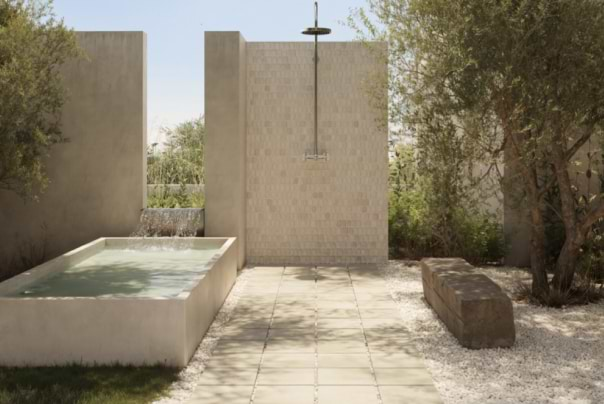
Outdoor Living
Bring a cohesive material story outside while keeping the needs of patios, paths and exposed surfaces in view.
October 19, 2026
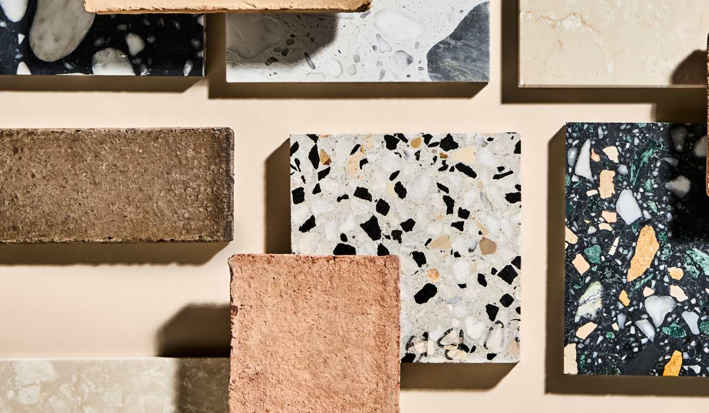
Planning & Advice
Use a focused shortlist and a simple comparison routine to choose materials with greater confidence.
October 19, 2026
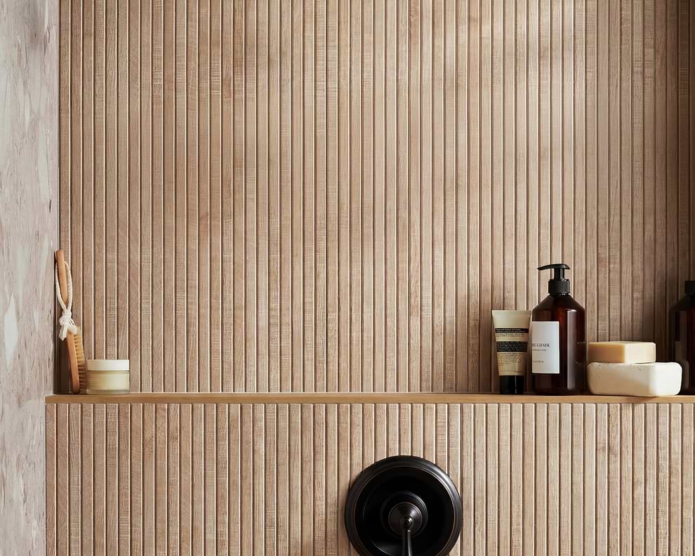
Bath & Shower
A restrained material palette, thoughtful scale and tactile details can turn an everyday bathroom into a welcoming retreat.
October 19, 2026